The tutorial images are based on using the old Blogger interface ~ if you wish to revert back to this interface to follow along with this tutorial then you can do so by clicking here: How to: Revert Back to the Old Blogger Interface
 A tip ~ through out my tutorials you'll find a selection of images, many of which appear to be blurry. This is to draw attention to the areas of focus which are usually outlined with a pink rectangle like that show to the right.
Special note: As with all of my tutorials, if you need to view a larger version of the example image simply click on the image to enlarge. Then click the "X" to return to the tutorial.
Now, let's begin...
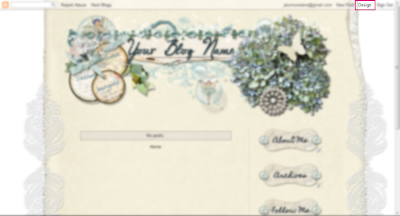
First, log into your blog and click on the "Design" link at the top right on your blog...
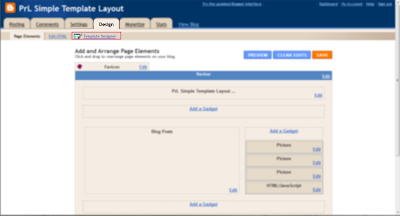
Next, you'll see the "Design" tab, click on the "Template Designer" link...
In the next view you'll see a selection of template choices at the top...
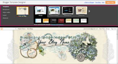
and a screen shot of your current blog theme and layout below...
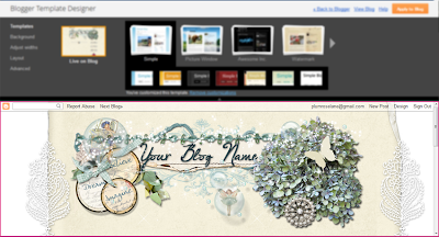
We'll be focusing on the "Simple" template since this is the easiest to alter for using designer themes like the ones I offer here at Plumrose Lane...
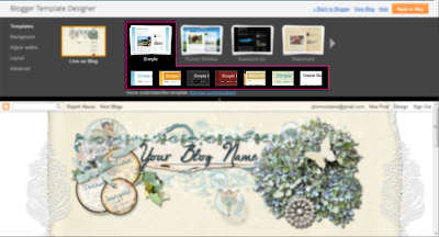
Before we begin: Through working the Template Designer I've found that selecting various templates, one on top of the other, can often leave snippets of code and glitches from previous templates. For this reason it's important to take note of the phrase just below the example templates ~ the one that says "You've customized this template: Remove customization". If this phrase does not appear then you may skip this step and continue on below however if this phrase appears, go ahead and click the "Remove customization"...
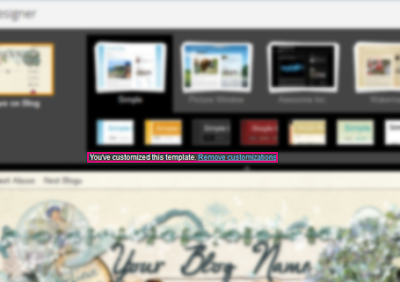
This will clear any previous settings and in a sense allow you to begin with a clean slate. However, please note, if you click on this option after working on your template it will reset all of the changes you've made so be careful when choosing this option after continuing on with the following steps.
Now moving on....
To begin, we'll be using the first choice in the "Simple" template lineup so click on the blue and white image...
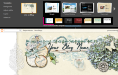
The nice thing about using the "Template Designer" is you'll see the changes you make immediately take effect...
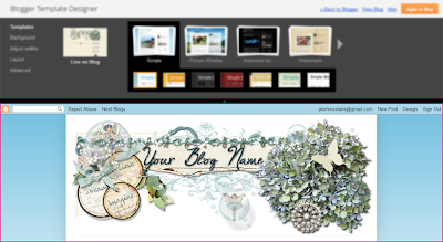
note how the background has now changed to blue and white in the bottom example area
Now that you've selected the "Simple" template, we're going to make some minor adjustments to remove the blue background and other standard settings with this template.So let's continue on by clicking the "Advanced" link in the left menu area...
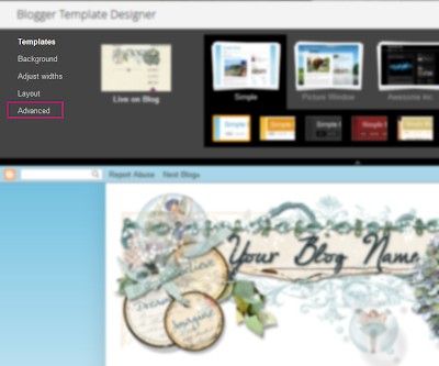
Next find the "Backgrounds" link, second choice from the top, and click on that...
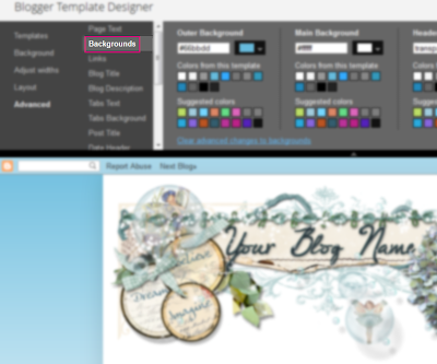
Here we will change the background colors to transparent to allow the designer's background to show.
We will be changing the color settings in each of the three areas to transparent...
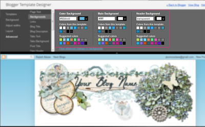
So beginning with the first section "Outer Background", click the small arrow next to the color...
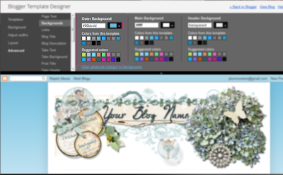
A drop-down menu will appear...
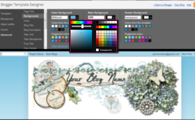
Click on the small checked box next to "Transparent" to change the color...
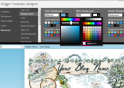
Immediately you'll notice the background color change in the screenshot area below...
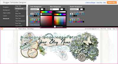
We'll continue on, changing the color for the "Main Background" and "Header Background", if applicable, to transparent...
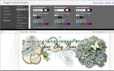
Your "Backgrounds" section should now look like this...

With that section completed we'll now move on to making additional changes to the template. While the background looks more suited for the designer theme, there are default settings which are still interfering with the overall look of the theme.
We'll now move on down to the "Tabs Background" section, this is the seventh link down on the list...
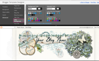
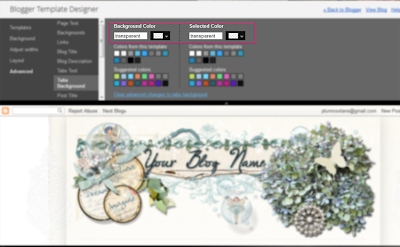
We'll go ahead and change the "Background Color" and "Selected Color" settings to transparent as we did above and the end result should look like this...
With that section completed we'll move on in the same manner to the "Post Footer" section. In this section we'll change only the "Background Color" and "Shadow Color" to transparent...
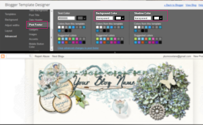
Leaving the "Text Color" as it is.
The next category we'll work on is the "Images", changing the "Background Color" and "Border Color" to transparent...
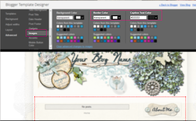
Special note: Looking at my example image above you'll notice a red dotted line appears in the lower screen shot area. This is a helpful guide that appears in certain sections of the Template Designer so don't be alarmed if this shows up. It's simply serves as a visual guide to show you what area you're making changes in.
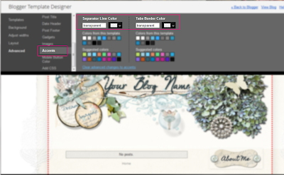
The last area we'll be working with is the "Accents" section where we'll change the "Separator Line Color" and "Tabs Border Color" to transparent...
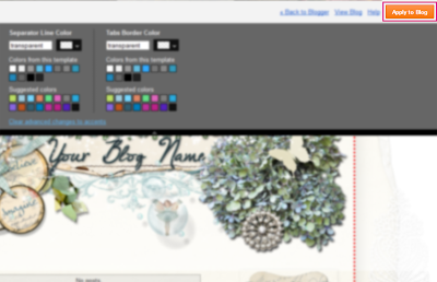
To complete our work with the Template Designer we'll need to save the changes we've made so be sure to click on the orange "Apply to Blog" button on the top right side...
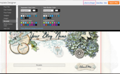
Our work in the Template Designer area is completed, however there are still a few more changes to be made before our theme is setup, so we will return once again to the Design area by clicking the "Back to Blogger" link in the right area, to the left of the orange button...
Back in the "Design" area you may notice some changes from how things looked before with your blog layout...
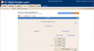
That's because each template has it's own default settings. For the "Simple" template the default settings are a staggered one column, two column, one column, layout. These aspects of the the template can also be changed and the size of each area can be modified in the "Template Designer" however we'll cover this in another tutorial.
If you were to look at your blog at this point, it might look nearly perfect, as in the example below...
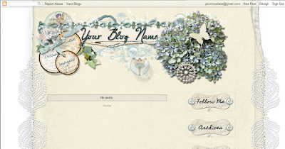
However, if you take a closer look you'll see that there are several aspects which are still off ~ extra shadowing and whiteouts that can interfere with a designer's theme, so we will now work on fixing those aspects. To do this we will need to work in the html area of your blog.
~Take a Break~ if you're looking to take a short break, now would be a good time before moving on to this next section.
Once again, we'll be returning back to the "Design" area of our blog so navigate to the "Design" tab and this time click on the "Edit HTML" link...
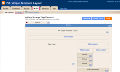
Important note: Before continuing on it is very important that you save a backup of your blog. Working in the html section can be tricky and so we want to be sure that any changes we make can be fixed by saving a backup.
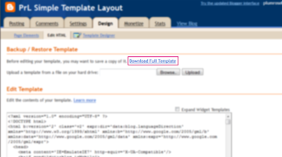
To do this, click on the "Download Full Template" link...
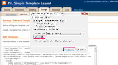
A pop-up window will appear, be sure the "Save File" button is selected and click "OK" to save a copy of your blog template to your computer...
Be sure you note where the backup template is saved before continuing on with the rest of this tutorial so you can easily find it in the future if you need to. The file will look like this on a Windows computer...
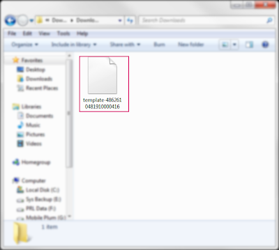
Moving back to your blog, we're now ready to begin working in the HTML code area. We're going to be making some minor changes to remove some of the extra shadowing that's default with the "Simple" template.
Remember~ working in this area is extremely tricky, so please... take your time, be very careful ~ change only the items covered in this tutorial. If you find you've made a mistake, then simply leave this area without saving your changes and the mistakes you've made will not be permanent.
We will now move down the open box area with html code in it. So let's begin by scrolling down slightly on the page so that this area is in the middle of our window...
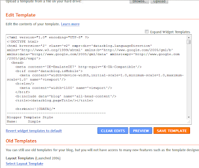
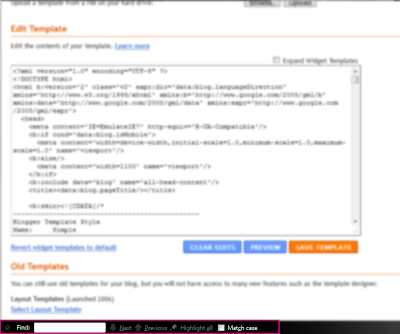
In order to make changes to this area we will also need to activate the "Find" feature in our browser. This can be found in different locations depending upon what browser you are using but in most cases you can active this feature by holding down the "Ctrl" key ("Command" key on a Mac) and then click on the "F" key.
In the version of the Firefox browser I use it appears at the bottom of the window and here is what that looks like...
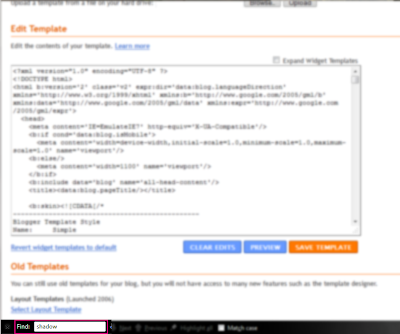
Now with the "Find" feature activated, we're going to begin searching for the items we need to delete. So let's begin by typing in the word "shadow" in the Find box like so...
Now click on the "Next" button, or in some cases "Find", and the first appearance of the word "Shadow" in the html code will show up highlighted as in the example below...
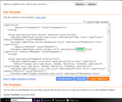
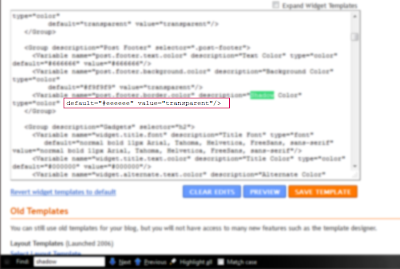
Now, locate the section "value=#eeeeee" and change it to: "value=transparent" so that section should now look like this...
Now we're going to search for the next appearance of the word "shadow" in the code, so click on "next" or "find" to move to the next location where this word appears in the code...
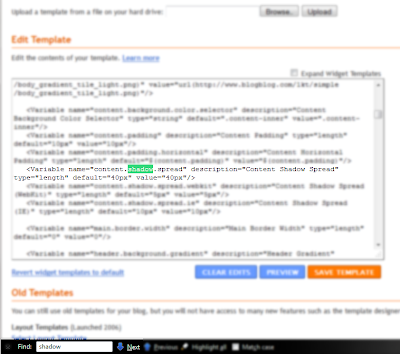
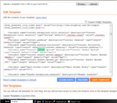
Now, locate the section "value="40px"" and change it to: "value="0px"" so that section should now look like this...
Once again we'll locate the next appearance of "shadow" which looks like this...
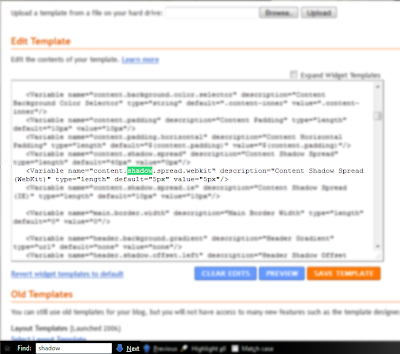
Now, locate the section "value="5px"" and change it to: "value="0px"" so that section should now look like this...
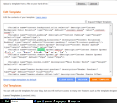
Once again we'll locate the next appearance of "shadow" which looks like this...
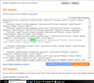
Now, locate the section "value="10px"" and change it to: "value="0px"" so that section should now look like this...
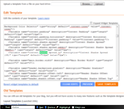
With that we have now completed this revising the html area of your blog. The template is now set to a clean format.
Please note: at the time I'm writing this I am still currently working on a way to remove the final "shadow" around images. While I have successfully removed them in the past, I've found that this portion is not dependable and so I will continue working on a fix for this portion before posting the remaining portion here.
Now that you have your new template set up and in place you can continue on to using this tutorial to install one of my themes:
Please take your time and investigate the "Template Designer" further where you'll find other fun features like adjusting the widths of your blog and sidebar area to accommodate different blog theme widths.
Here are the sizes I've found that work the best with most designer backgrounds:
"Entire blog size 900/"Right sidebar" = 360
Three column - on either side
"Entire blog" size 920/"Left sidebar" = 200/"Right sidebar" =200
Three column - both on right side
"Entire blog" size 930px/"Right sidebar" = 430px
Enjoy~
